


Sorting Fact from Fear - Helping Parents & Caregivers See Past the Statistical Hype
- The White Hatter

- Sep 22, 2025
- 4 min read

Recently, we came across a popular bar graph online that claimed to show how much time people spend on different life activities between the ages of 18 and 90. At first glance, the chart was eye catching, even alarming. Its design suggested that sleep, work, and, most strikingly, screen time swallowed nearly all of a person’s life, leaving only a sliver for free time. For many parents, this kind of image triggers a gasp and immediate concern. We believe this is why it was shared, to imply that parents and caregivers should push youth and teens away from technology, the internet, and social media.
However, here’s the problem, the graphic had no source citation, no methodology, and no connection to actual data. We asked for this data from the source, but at the time of writing this article, we still had not received any.
This raises an important question, “Does the graphic reflect reality, or was it a viral infographic designed to provoke strong feelings to create and push a narrative about technology and lifestyle?” Here’s the graph:
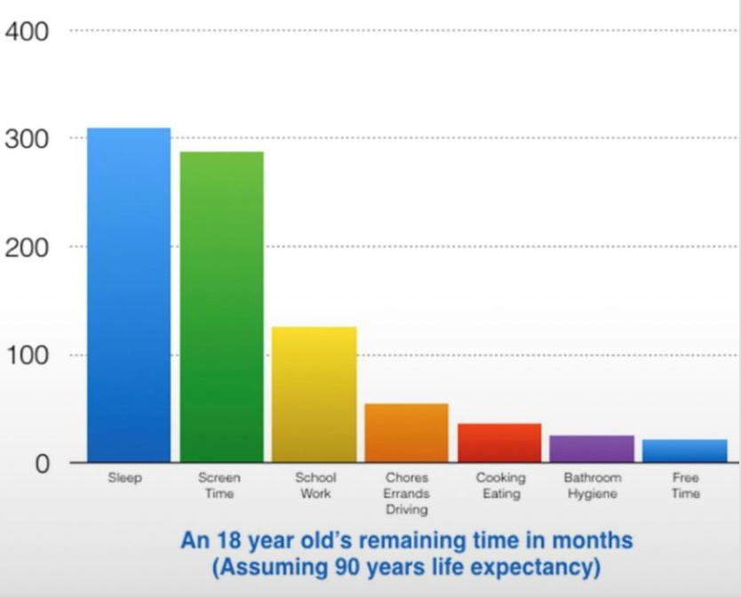
Here’s why we believe this graph is very questionable:
Life Expectancy Assumptions
The chart assumes everyone lives from age 18 to 90. While this makes for tidy math (72 years, or 864 months), life expectancy varies significantly. Many people won’t reach 90, while others will surpass it. As an example, the average life expectancy here in Canada is 81.7yrs. Basing the entire chart on a uniform number oversimplifies reality.
Sleep
It shows roughly 300 months spent sleeping, which matches 8 hours a night for an average lifespan. That part makes sense. But sleep isn’t static. Children and teens sleep more, older adults often less. The chart ignores these variations.
Screen Time
This is where exaggeration becomes clear. The chart depicts screen use almost on par with sleep. That would require 6-8 hours of daily “screen time” for life, which doesn’t align with actual research. It also appears to lumps together entertainment, education, and work, very different uses of technology.
Work and School
The chart underestimates working years. Most adults spend 35-45 years in the workforce, not 10. On the flip side, it spreads “school” evenly across life, when in reality, most education is concentrated before age 25.
Daily Tasks
Chores, commuting, hygiene, and cooking are shown as neat blocks. In reality, these vary widely by age, family circumstances, and culture. The chart simply rounded numbers to fit its story.
Free Time
Perhaps the most misleading part, the above noted graph makes it appear that free time nearly disappears. Yet according to time-use surveys (such as those from Statistics Canada and the U.S. Bureau of Labor Statistics), adults consistently report 4-5 hours of leisure per day after sleep, work, and chores. That’s far more than the sliver suggested.
To get a clearer view, we turned to Statistics Canada’s 2022 General Social Survey on Time Use, national health surveys, and international comparisons. Using this data, we built a chart of how Canadians spend their time from age 18 onward.
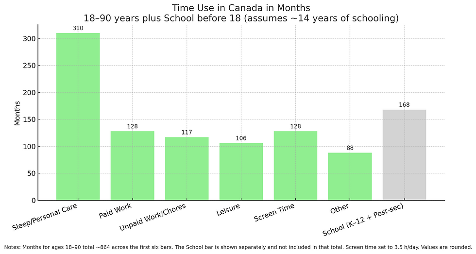
Where the first graph inflated screen use and downplayed work, our chart is based on research done here in Canada. The proportions reflect how people actually live.
Sleep and personal care: 8-9 hours daily, totalling about 310 months over adult life.
Paid and unpaid work: Around one-quarter of adult life, matching workforce and household data.
Screen time: About 3.5 hours/day (128 months). Significant, yes, but far less than sleep or work.
Leisure: A healthy 106 months, far from disappearing.
Schooling (K-12 and post-secondary) is clearly separated, showing about 14 years, or 168 months. Unlike the viral chart, which spread “school” across all ages, this approach reflects reality.
We used daily averages to calculate months across the lifespan. The viral version tossed out round numbers without showing the math. Ours respects the evidence.
So, why does this matters for parents and caregivers?
When parents see a viral infographic that suggests “technology is stealing your child’s life,” it’s easy to panic. However, scare tactics don’t help families make informed choices. Research shows a more nuanced reality:
Yes, technology is a big part of modern life.
No, it’s not erasing free time or overtaking sleep.
Balance, not avoidance, is the key.
At The White Hatter, we have always promoted a balanced lifestyle with technology. Looking at the data, the Canadian picture seems pretty balanced. Outside of sleep, time is shared across work, leisure, relationships, and yes, screen use. Technology is present, but it doesn’t dominate life, as it did in the first graph, unless we allow it to.
The next time you see a viral graphic that makes you gasp, pause and ask, “Where did the numbers come from?” If the source isn’t clear, it may be designed more to shock than to inform.
As parents and caregivers, it’s not about fearing technology or assuming it consumes every waking moment. It’s about helping our kids, and ourselves, use it with purpose, balance, and awareness. Real research shows that life is fuller, freer, and more balanced than some charts making their rounds suggest.
Digital Food For Thought
The White Hatter
Facts Not Fear, Facts Not Emotions, Enlighten Not Frighten, Know Tech Not No Tech
References:


